TYPOGRAPHY PSYCHOLOGY
First off, what is typography or font psychology? It is the study of how different fonts impact thoughts, feelings, and associations. Most of the time this is unconscious + pre-programmed by society and things we interact with daily. It is important to know this when designing logos, print materials, and really anything involving typography.
Why does typography matter? It is more than picking an aesthetic font or something trendy. Choosing typography for a project is very strategic for logo design, web design, and anything in between. Knowing what each type of family or category can convey is important as a designer.
Also, not only the traditional meaning below but also the connotations and societal norms of fonts. For example, you wouldn’t want to use a girl boss script for a business trying to appeal to a high-end demographic.
One last fun fact before the useful info — the dreaded comic sans, do you know it is used so much because of its readability for dyslexic individuals, something not taken into consideration when we designers bash this innocent font.
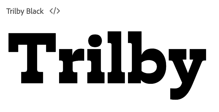
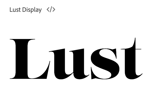
Here is some basic info + what the main fonts categories look like:
All these fonts were sources from adobe fonts
1// Serif -- Traditional, Respectable, Reliable, Comfort
2// Sans Serif -- Stability, Modern, Objective, Clean
3// Slab Serif -- Confident, Solid, Versatile
4// Script -- Elegnace, Creativity, Affectionate
5// Mono -- Sophisticated, Techy, Smart
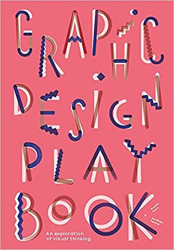
6// Display -- Friendly, Expressive, Amusing, Unique
Weight also plays a part
1// Light Weight -- delicate + modern
2// Medium Weight -- clean + readable
3// Bold Weight -- strong + powerful
Here are some more resources to learn more about the psych of typography:
2// The Visual History of Type
3// Logo Design Love
